A brand with no voice
A generic identity lost among dozens of brands on the store shelf, stopping no one.
From a silent commodity waiting on a shelf, to a captivating story ready to be heard.
Before focusing on content, we needed a brand worth talking about. That is why we started with the most challenging piece: the logo.
Riam is an Emirati brand renowned for its fresh, natural products and unwavering quality. The challenge lay not in the product itself, but in its silent presence: a visual identity that faded on the shelf, uninspiring content, and a logo that failed to reflect the premium quality within.
A generic identity lost among dozens of brands on the store shelf, stopping no one.
Nothing spoke of freshness, quality, or where the product came from. The content never went beyond product shots.
And the logo itself? Four problems, not one:
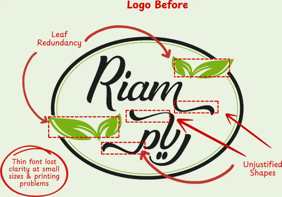
Both versions are clean vectors pulled straight from the original identity files. What you see is the logo itself, not a picture of it.
↔ Drag the handle to compare
From scattered details to one iconic mark. We stripped away the clutter to reveal the true essence.
A bolder, more robust typographic weight. 'Riam' now commands attention from a distance, maintaining flawless legibility even at the smallest print scales.
We reshaped the curve of the ra to mirror the Latin R, so the Arabic and the Latin sit as one balanced block.
Keep the warmth, and lift the brand to a modern, confident place.
Riam Rice is a brand rooted in authenticity, family, and the joy of everyday cooking. The goal was never to erase that feeling and swap it for cold modernity, but to make it clearer: a kitchen staple that feels familiar and inspiring at the same time.
Here, color is never random; every shade has a purpose: deep green grounds the brand in natural trust, gray brings pure clarity, black delivers striking strength, and lime breathes vibrant freshness into the identity.
Wheat stalks and leaves, pulled from the identity guide as vector files. Try changing the color and opacity: it's the same flexibility the guide calls for.
The true test of an identity isn't found within the pages of its brand book, but on the day it goes live. Here, the exact same system adapts flawlessly to a single post or a five-slide carousel: the subject changes, yet the color, typeface, and logo placement remain unshakable constants.
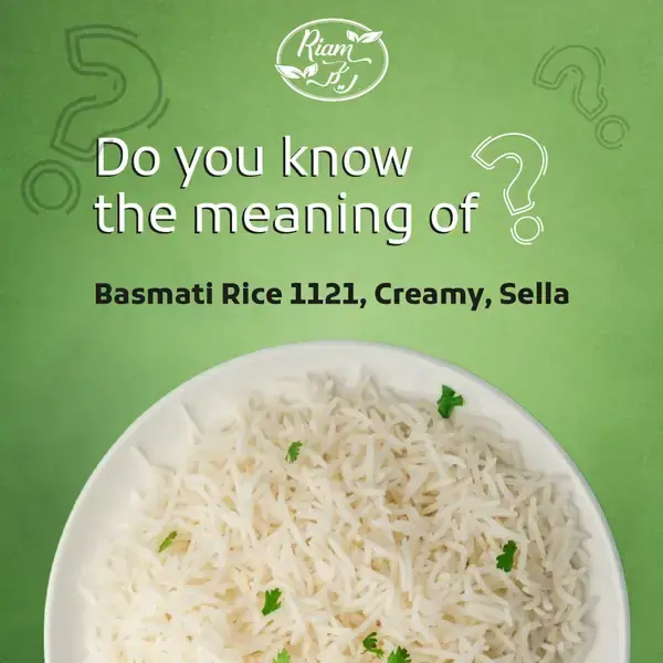
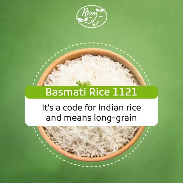
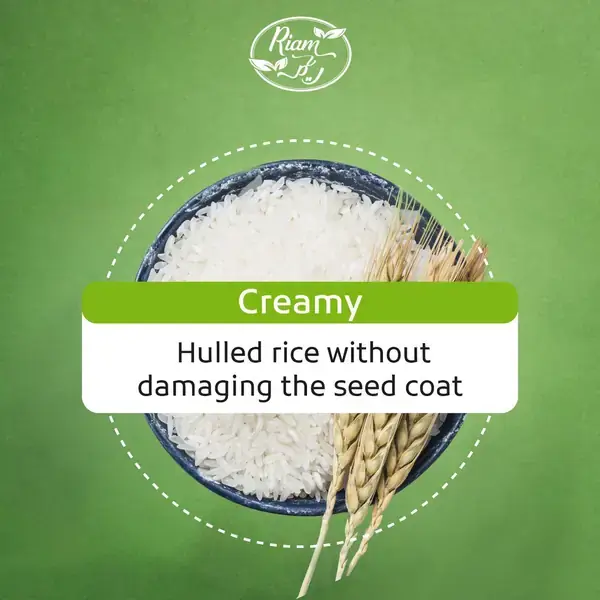
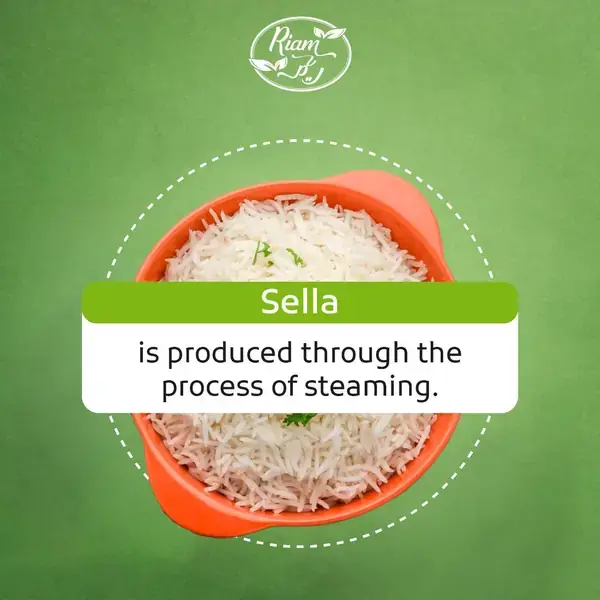
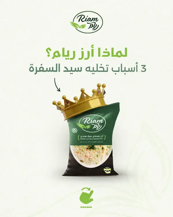
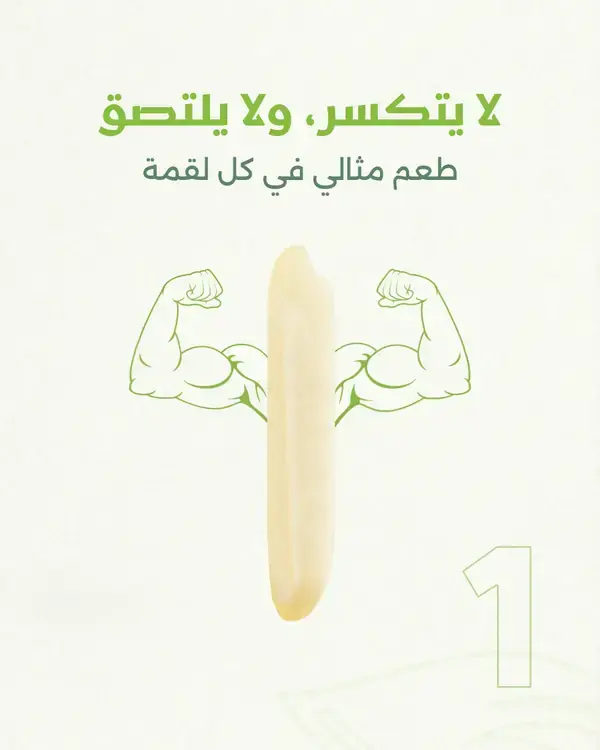
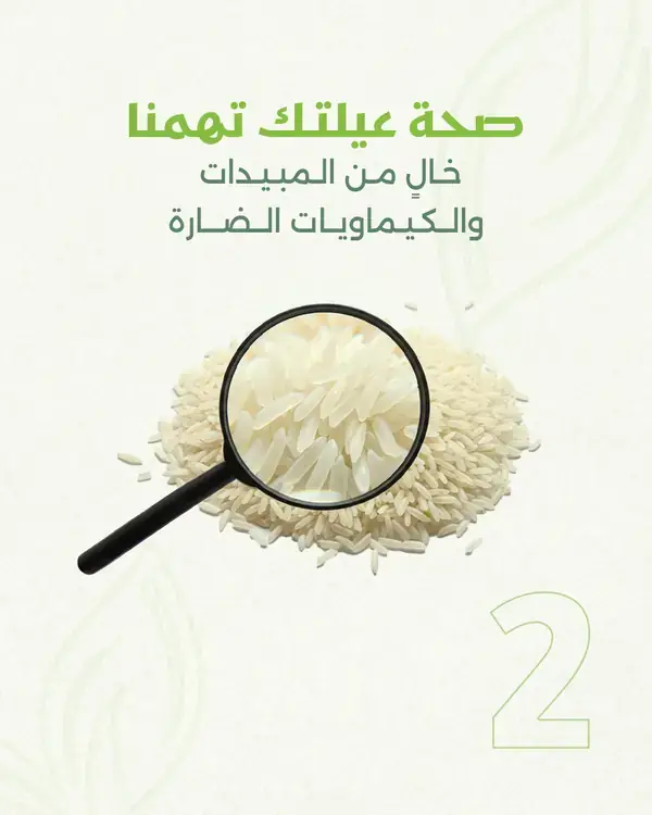
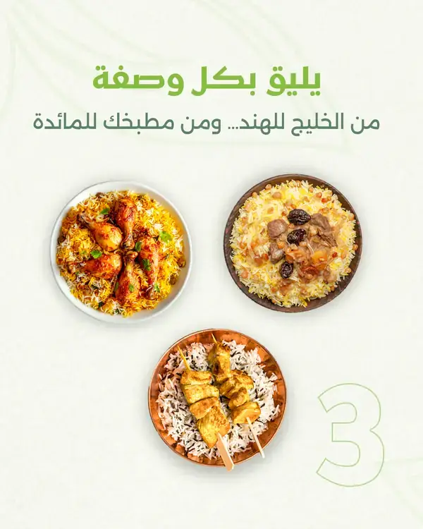
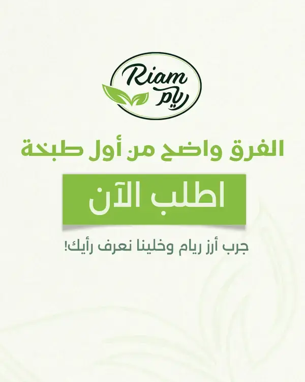
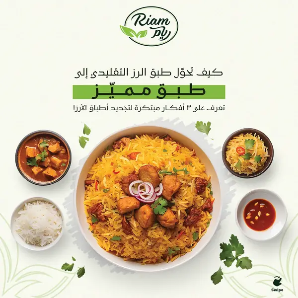
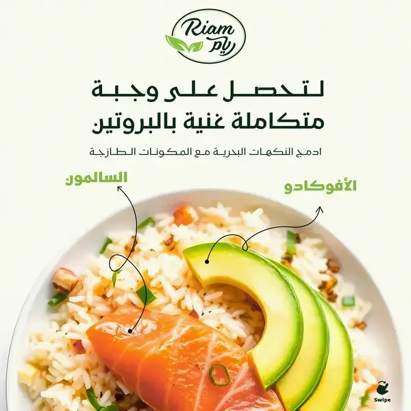
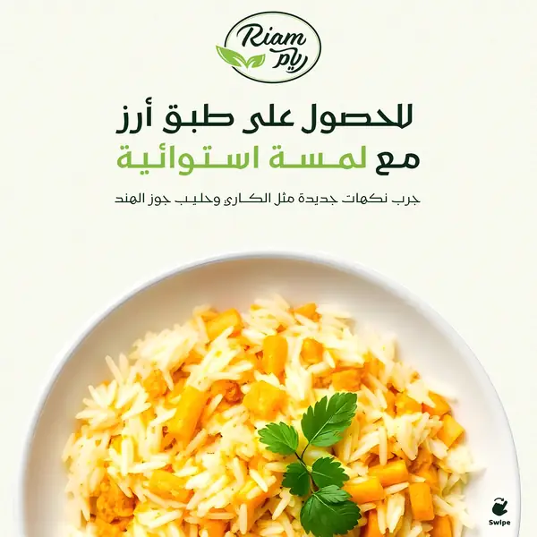
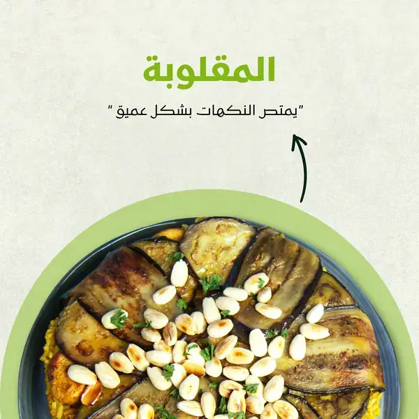
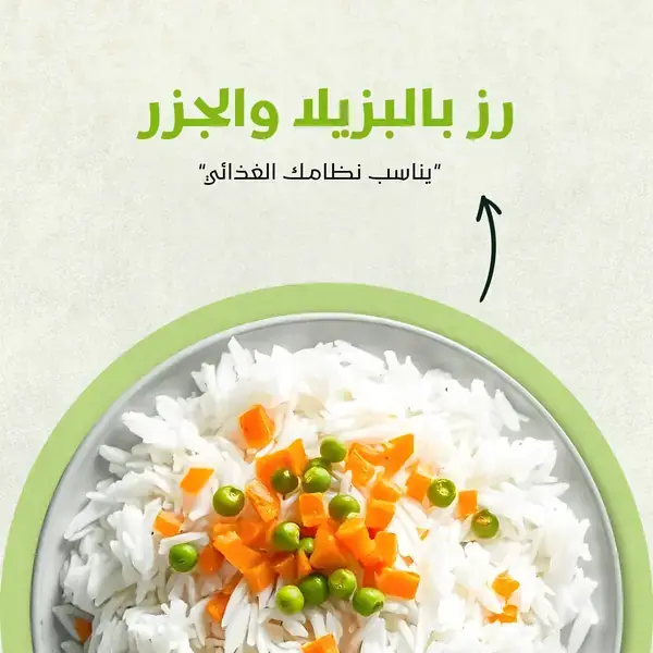
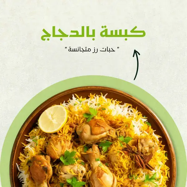
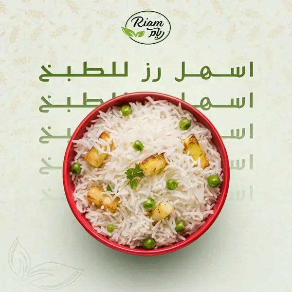
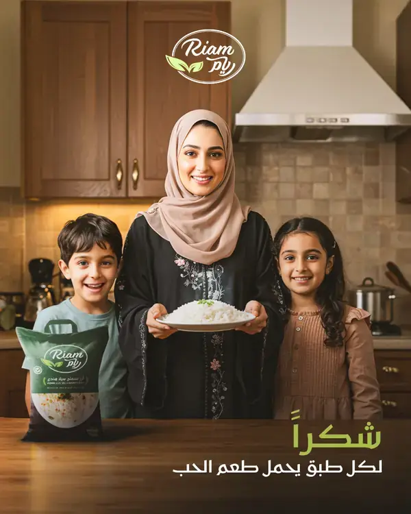
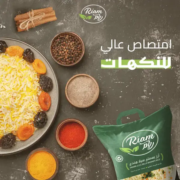
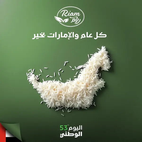
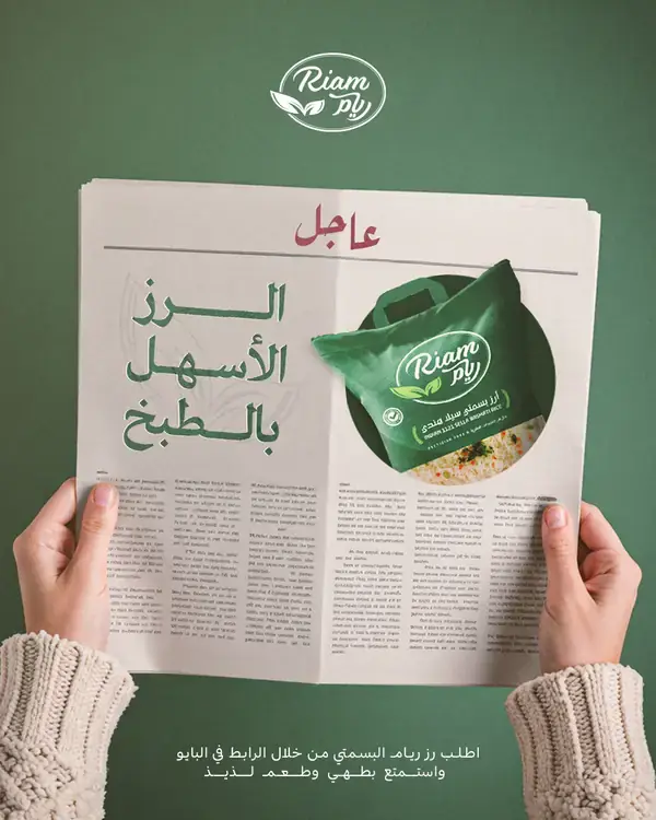
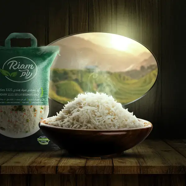
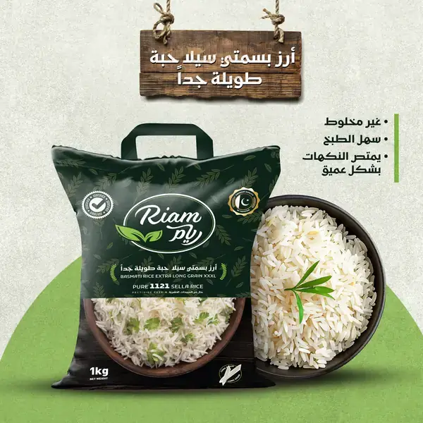
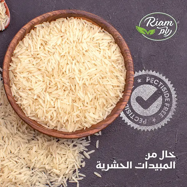
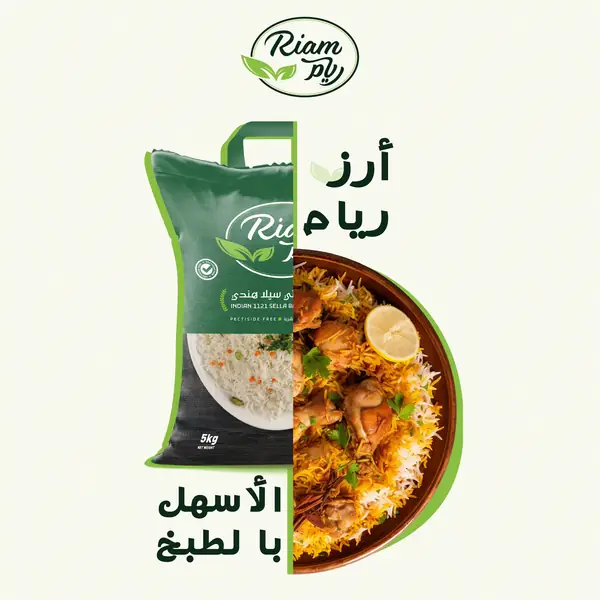
Rice is a commodity that is hard to tell apart and easy to scroll past. So instead of advertising rice, we produced a program that cooks with it.

We turned recipes into stories. We built a full kitchen studio from scratch, brought in some of the region's best cooking creators, and tuned the pace of every episode to hold the viewer in the first three seconds.
Built for the scroll: a hook in the first three seconds, a clear recipe, and an ending that nudges the viewer to hit save.
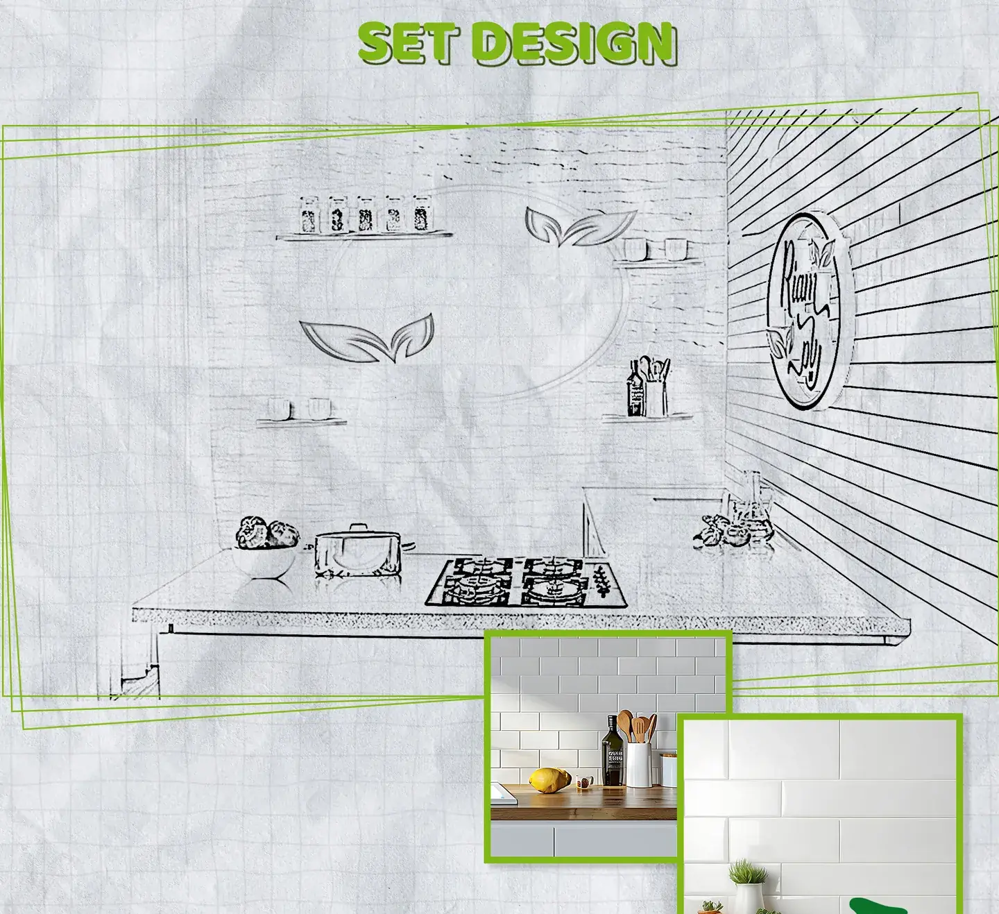
Not a rented backdrop. The kitchen was designed to the identity: the shelves, the colors, even where the logo sits in frame.
Every episode with a chef or creator who has their own audience. The brand borrows trust that already exists instead of building it from zero.
This is the design deck exactly as delivered: one continuous board, from the first mood frame to the kitchen with cameras rolling.
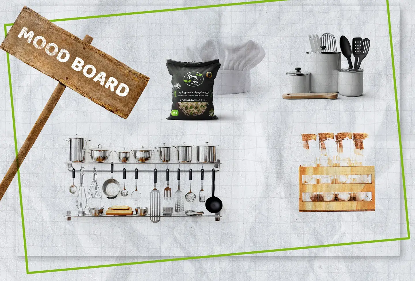

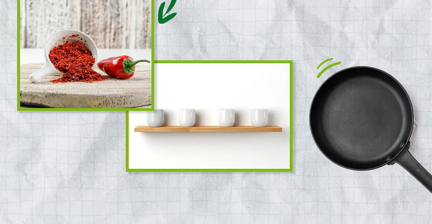
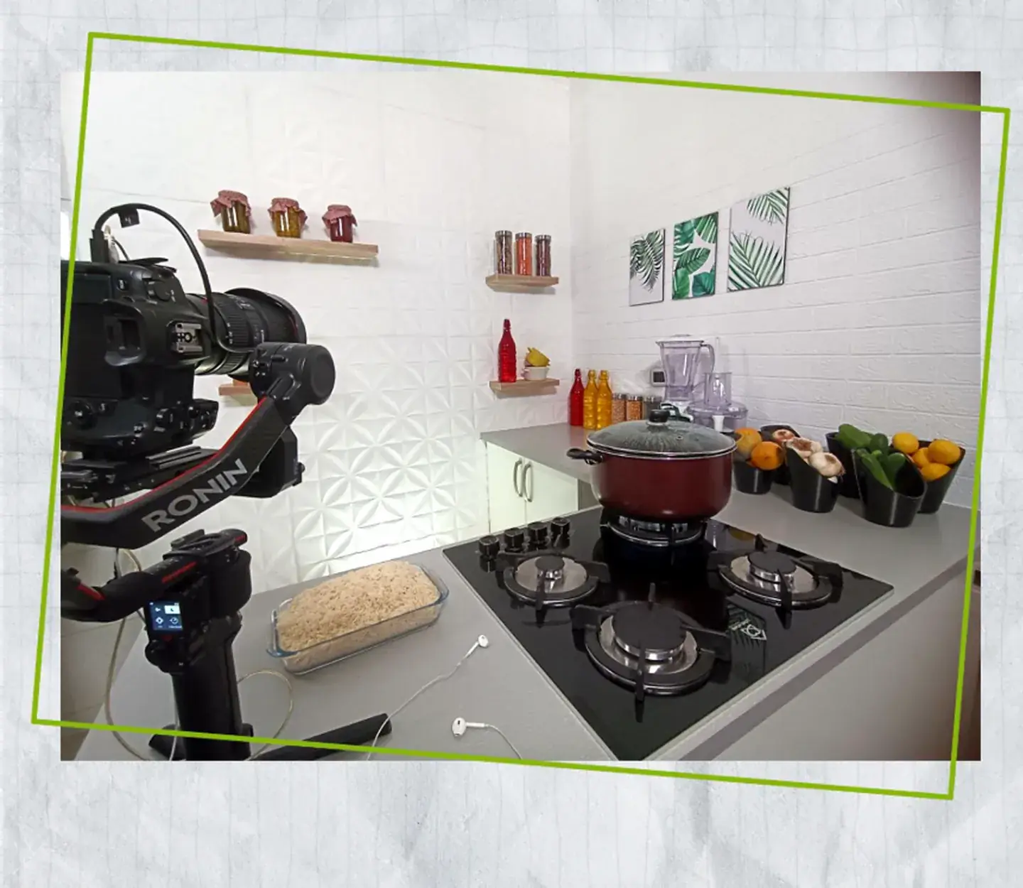
We gathered the materials, textures and tools: wood, stainless steel, clean white, and green touches from the identity.
We drew the frame before building it: where the cook stands, the shelves, and where the logo sits in every shot.
A full build. All twenty-four episodes were shot here, and the set itself became part of the program's identity.
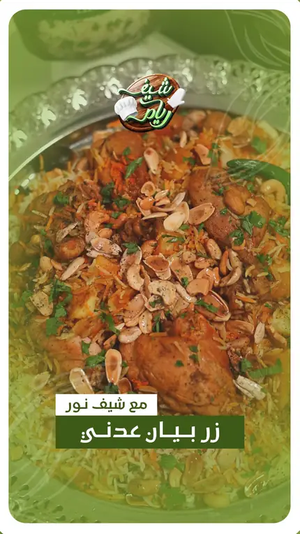
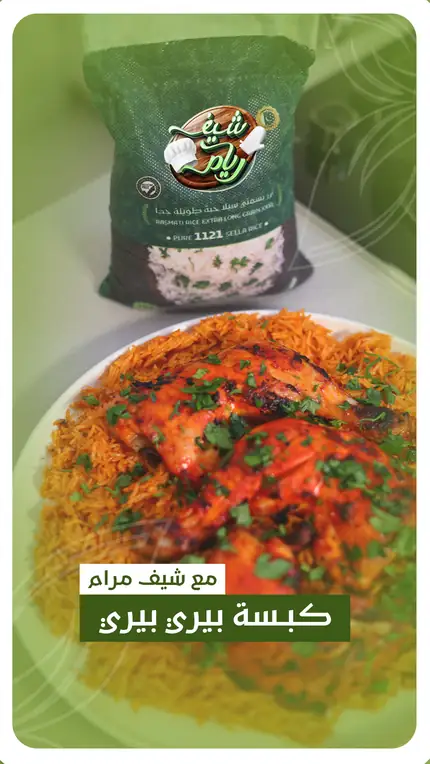
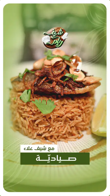
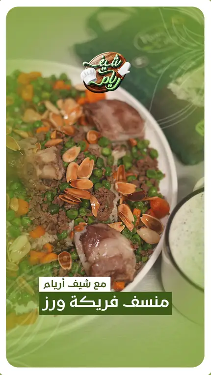
Reels, stories and posts: every format built for its platform, with the same identity and the same voice.
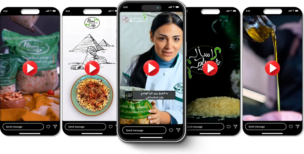
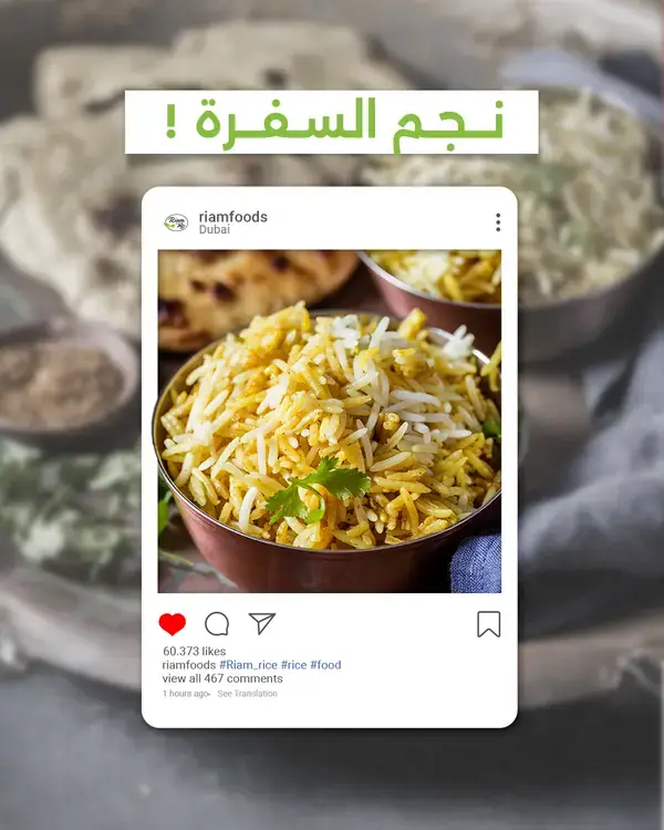
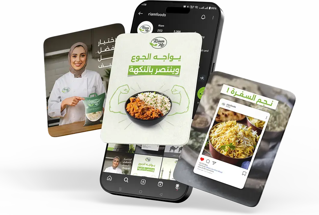
The campaign earned millions of views and lifted visibility and trust together. More importantly: Riam now has a distinct voice in a market where everyone repeats the same line.
When food meets story, a brand does not make content. It makes culture.
Got a product that's hard to tell apart from the rest? That's exactly the kind of case we work on.