Containers removed
No circle, no square. The word became the shape, so it took all the space available to it.
A specialty coffee roastery in Jeddah. One creative platform, and a packaging system with room for every new harvest.
Specialty coffee in a crowded market. What separates one bag from the next isn't taste alone. It's what the eye takes in before the bag is ever opened.
Purple Cups is a specialty coffee roastery based in Jeddah. It sources its harvests from Ethiopia, Colombia, Brazil, Uganda, Yemen and beyond, roasts them to order, and sells them through its online store.
The idea was there from the start: a digital clock typeface. The problem was never the idea itself, but its execution and the layers stacked on top of it.
The new version here is vector art pulled straight from the original identity files: what you see is the logo itself, not a picture of it. Notice how much more of the same frame the name now fills.
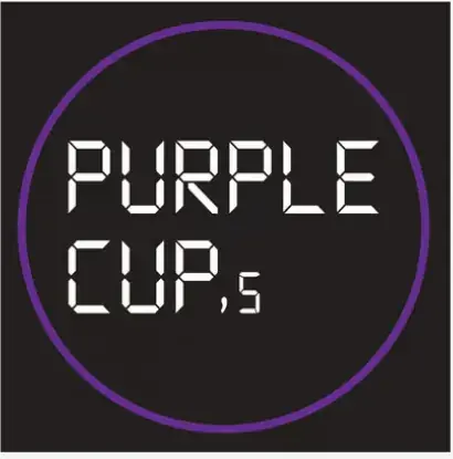
No circle, no square. The word became the shape, so it took all the space available to it.
CUP'S with a proper apostrophe, and the digital segments turned into solid blocks that read from a distance.
A coffee bean inside an octagon built from the same segments. It works as an app icon and as a stamp on a cup.
The digital clock idea did not come from us. The client explicitly wanted it, and for good reason: the taste for vintage was peaking in the Saudi market in 2024. So we did not scrap the idea. We rearranged it and rebuilt it.
Every letter is built from straight segments with cut corners, exactly like digital clock numerals. This is what the client wanted, and this is what we kept.
The mark is built from the same segments, so it never looks pasted on. And it is the only yellow element, so it becomes the point where the eye stops.
IT'S COFFEE O'CLOCK is set in the same typeface, with COFFEE alone in yellow. The line is part of the brand, not a caption underneath it.
Purple is the brand's own name, so it is not up for negotiation. Yellow is an accent, not a background: the moment it spreads into a surface, it loses its job as the place the eye stops.
Every icon is built from solid color areas. The reason is practical, not only aesthetic: these shapes will print in different colors for every harvest, and gradients do not survive recoloring.
The camel, the palm and the dallah come from the Gulf. The coffee branch, the bean and the cup come from the harvest's home country. The vocabulary itself traces the journey: from the farm to the Saudi cup.
The camel is the same camel across all eighteen varieties. What changes is the square behind it. This separation of shape from color is what made the whole system possible.
Eighteen varieties on one shelf. Designing each one separately means eighteen decisions, and eighteen chances to break the consistency. So we built one rule instead of eighteen designs.
The pattern is not a repeating ornament. It is a composed collage: a 6×3 grid, one icon per cell, with the camel alone crossing three cells to tie the whole row together. The style is Mid-Century Modern Geometric Art: flat geometric shapes, solid color areas, and hard edges with no gradients.
This is the whole rule. The shapes never change. What changes is the cell palette: it takes the flag colors of the country the harvest came from. So the shelf reads like a map, and we design once instead of eighteen times. Pick a country to see its bag.
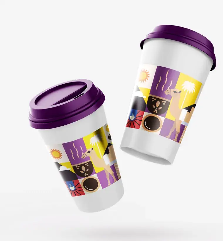
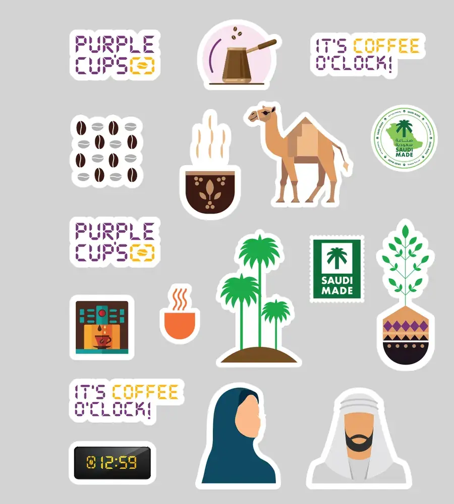
The cup, the gift box, the sticker sheet. The same band at the same relative height every time, so its position in the frame becomes a signature you would recognize even if the logo were cropped out.
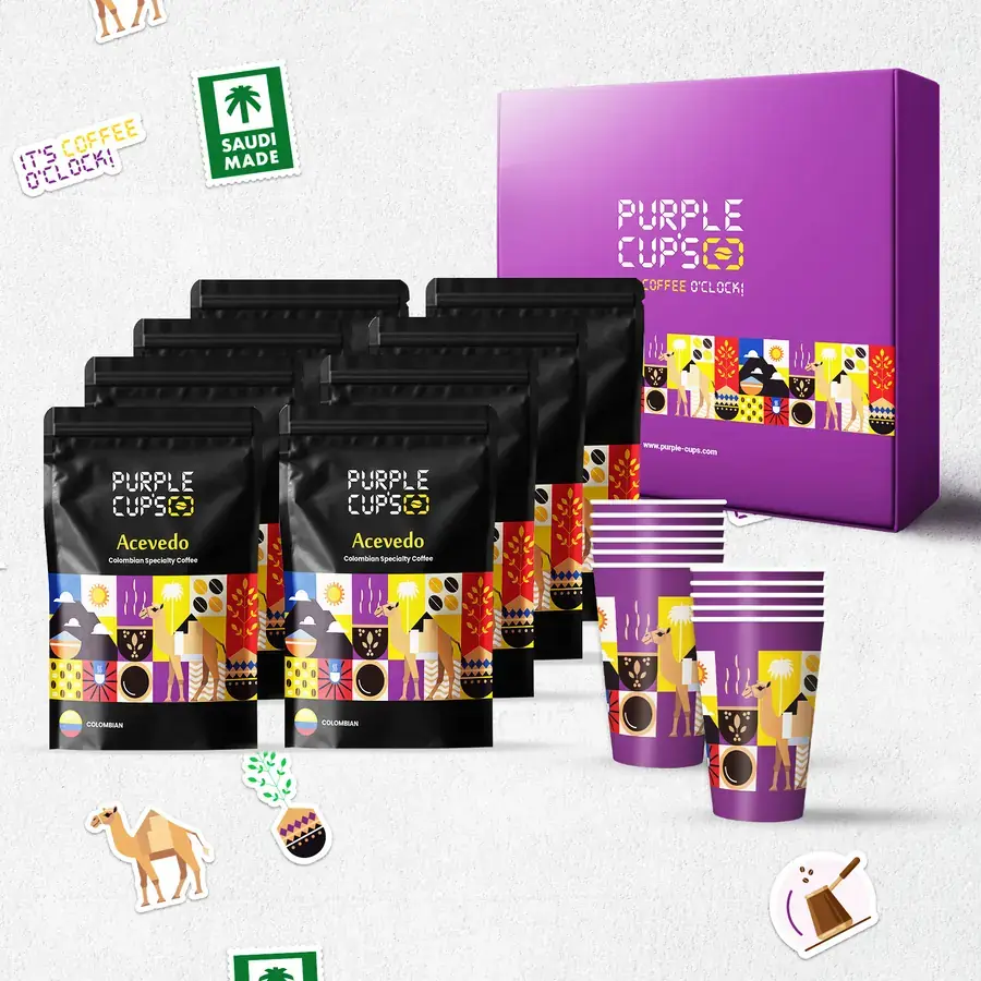
On the black bag the pattern glows. On the white cup it becomes the only block of color, so it works from further away.
A gift is not a product on a shelf. So it took the name's color directly, and the band stayed in place to tie it back to the family.
Every icon steps out of the grid and becomes its own piece. Among them a digital clock reading 12:59, one minute before coffee o'clock.
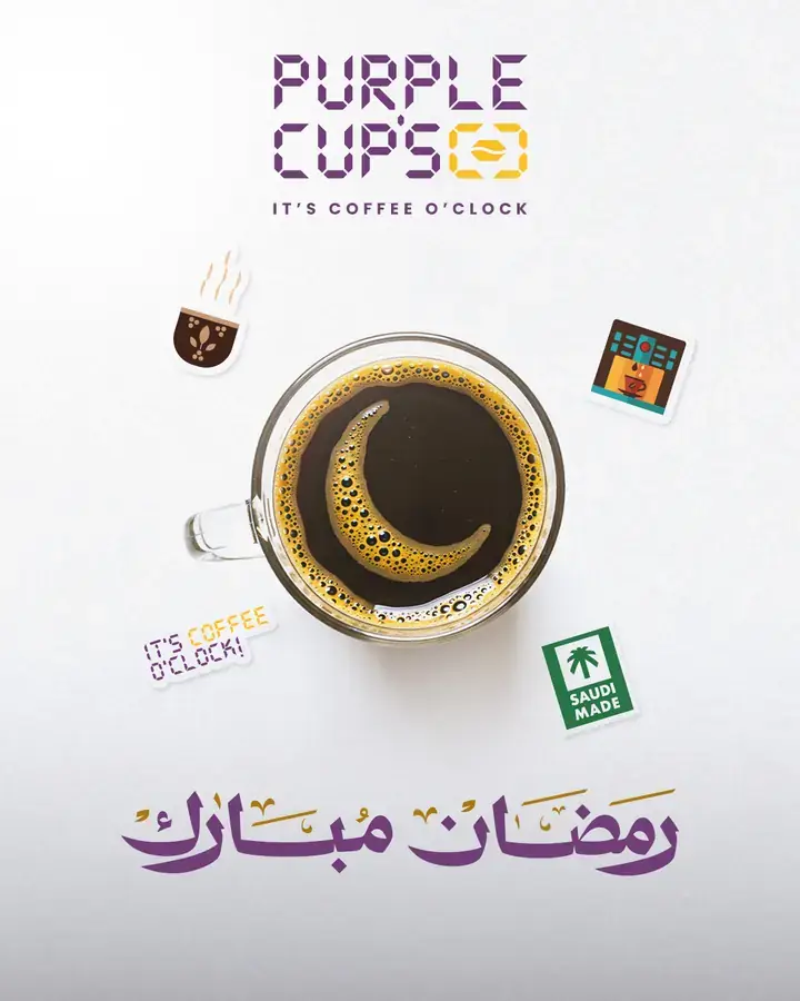
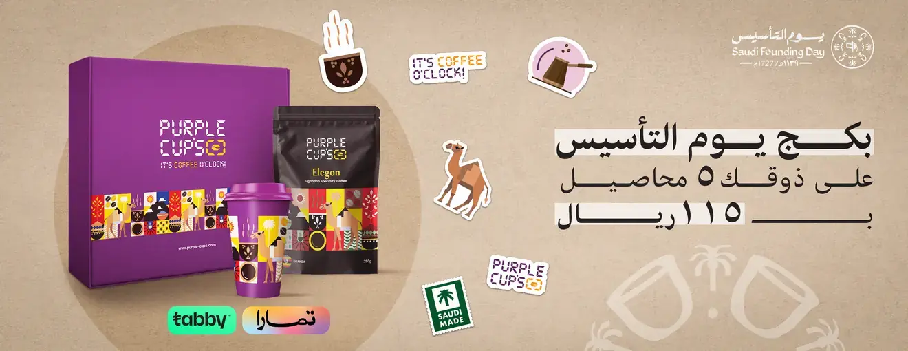
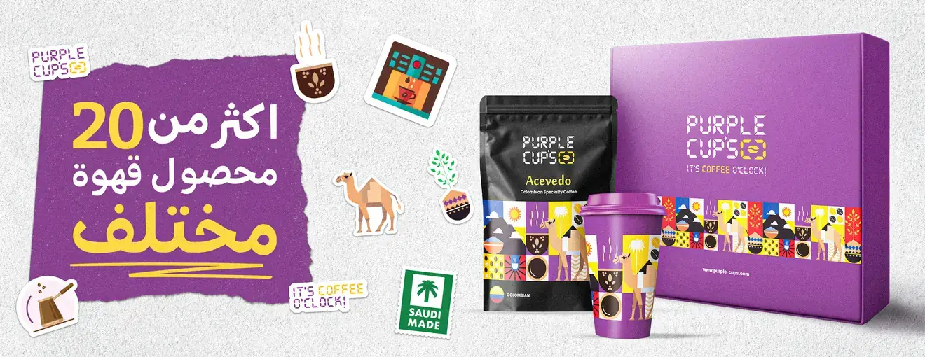
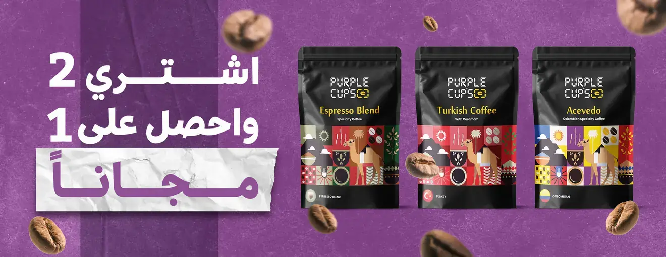
In the Saudi market you do not sit the seasons out: Ramadan, Founding Day, store promotions. All of them ran on the same icons, with no separate seasonal identity.
What matters most in a brand is that its name means something in the consumer's mind and heart. And when a visual identity is built on a clear creative platform, every element in it earns its meaning and its clarity.
Got a product line that keeps growing, where every addition means a new design from scratch? That is exactly the kind of case we work on.